Fulfillment Volume Metrics
Redesigning the interface based on user experience for Package recommendation
Overview
The original packing recommendation screen was cluttered and text-heavy. Items were listed in a flat structure with long numeric packaging codes, making it hard for team members to understand what to pack, in which container, or what to do if a recommendation failed. This caused delays and user frustration.
Problem:
These issues lead to higher costs, order fulfilment delays, more packaging mistakes, and lower productivity, which hurt customer satisfaction and profits.
Goal:
Make the screen faster to scan, easier to understand, and more actionable, especially when the system can’t automatically recommend packaging.
1 - Research - Talking to Store Employees
I conducted user interviews and live observational sessions across several stores. I focused on the real-world pressures of fulfilment, especially during peak times.
Some of the questions I explored:
“Can you walk me through how you choose a package?”
“What do you look at first?”
“Do you ever feel unsure or frustrated?”
“How does this process change when you're in a rush?”
“What kind of mistakes happen most often?
Heuristic Evaluation:
The old interface is functional but unintuitive. It lacks visual clarity, has minimal error handling, and requires users to rely on memory and prior training. The design doesn’t support fast-paced environments, which can lead to mistakes, delays, and frustration.
🧭 User Journey — Fulfilment Packing Recommendation
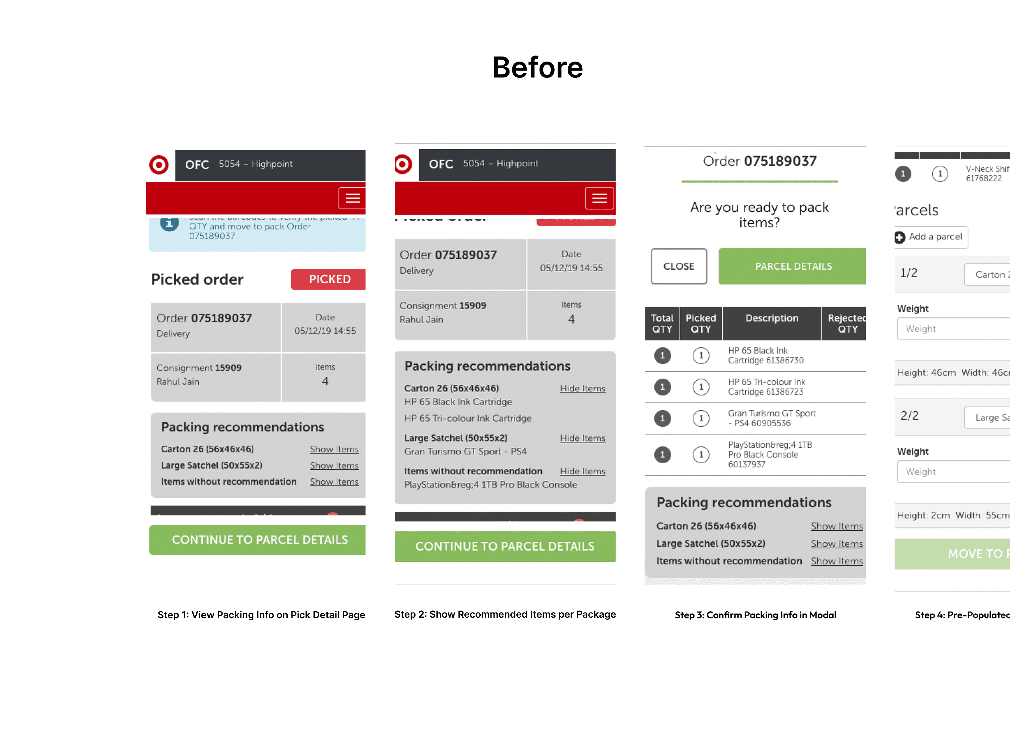
Step 1: View the Packing Info on the Pick Detail Page
📌 Users begin by reviewing picked orders.
The original design displayed minimal packing recommendations and required users to navigate further for item-specific details.
Step 2: Show Recommended Items per Package
📌 Users clicked "Show Items" to view what should go in each carton.
This improved clarity slightly, but still lacked direct interaction or validation to support decisions.
Step 3: Confirm Packing Info in Modal
📌 A confirmation modal now displays item details with corresponding packaging recommendations before packing.
This helped users cross-check selections and reduce packing errors.
The Challenges
Designing this solution came with several constraints:
Legacy Devices: Older in-store hardware had low resolution and couldn’t support images or complex animations.
Unintuitive Data: Package IDs were long numeric codes with no descriptive context.
Dynamic Recommendations: The backend constantly updated suggestions, so the UI had to remain stable and predictable.
Zero UX Foundation: This tool had evolved from engineering needs, not user needs, so I had to start from scratch and build cross-functional alignment.
3- Ideating with Sketches & Wireframes
Organising the Information | Sketching ideas & refining the Design | Handling Errors Smoothly |
|---|
What’s Improved in the New Design ("After")
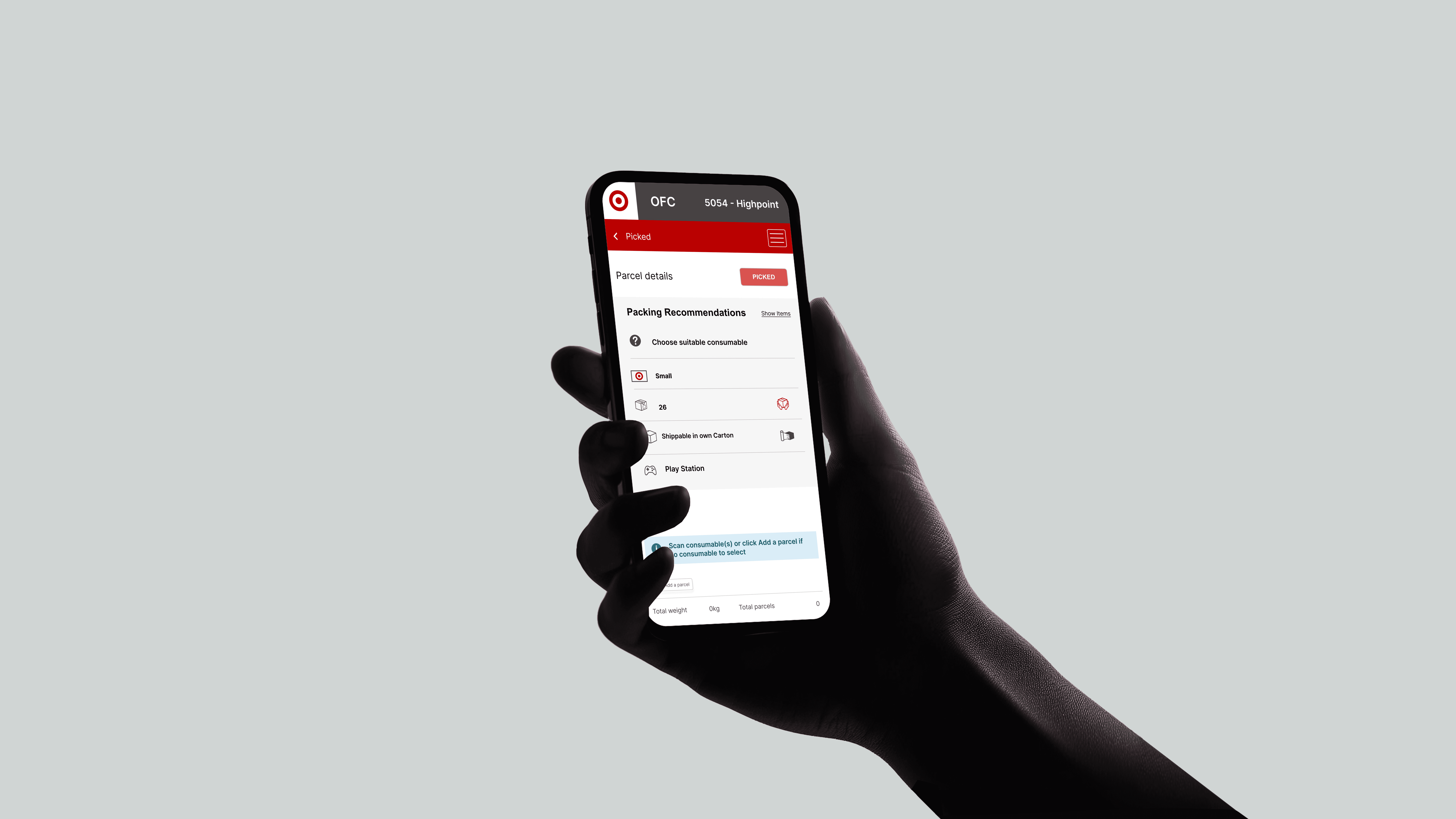
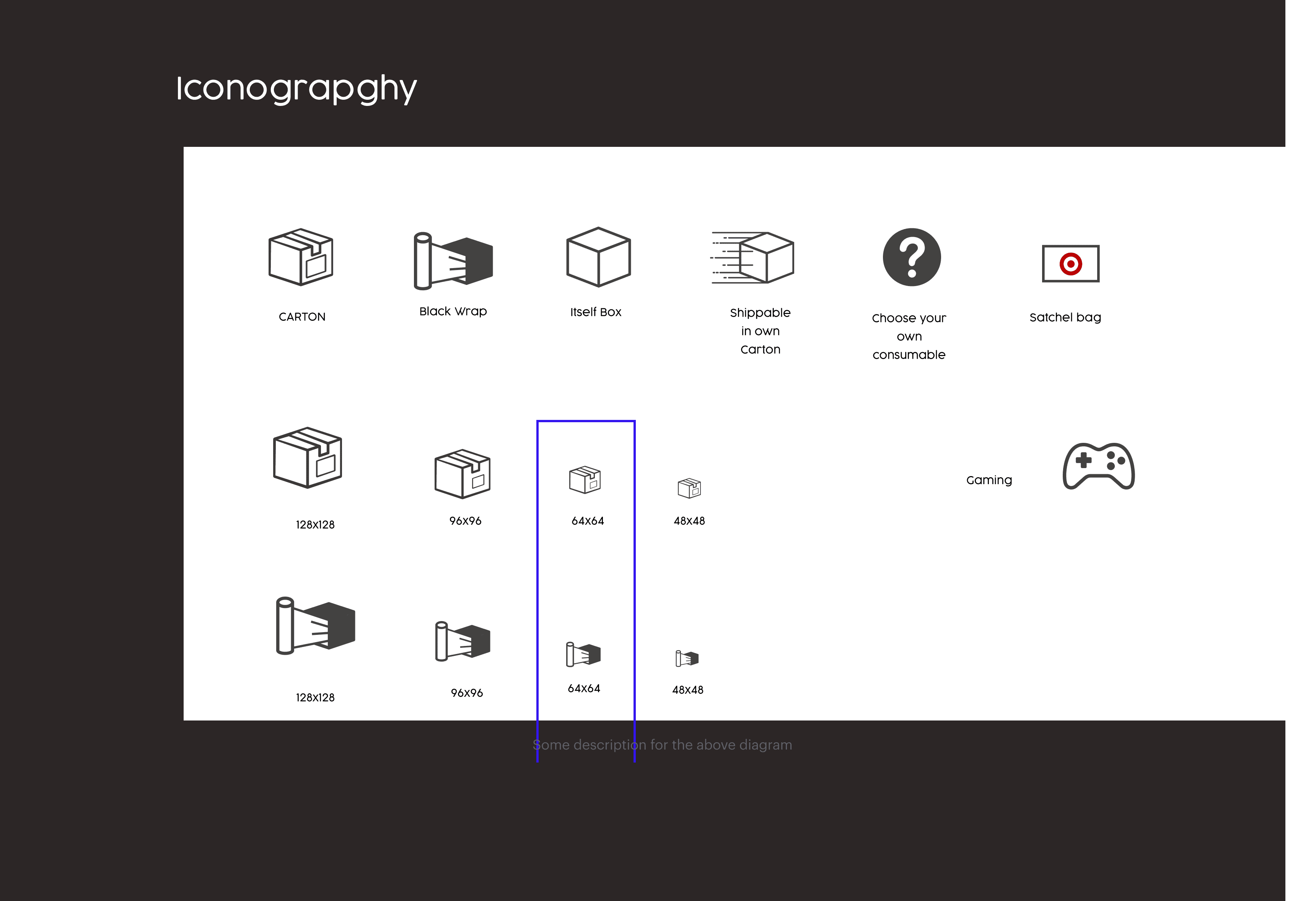
Modern Visual Language
Icons for each container type (e.g., satchel, own carton, PlayStation) help visually distinguish options quickly.
Error Messaging
The error state is highlighted in red, and an appropriate message:
Failed to load the packing recommendation. Please choose a suitable consumable.
Item Association Clarity
Items like "Lego Toy", "Denim Jeans", and "Sunglasses" are directly shown under their suggested containers.
User Guidance for Unassigned Items
The "Choose suitable consumable" section gives a clear fallback path if auto-recommendation fails or isn't available.
Cleaner Layout
More space-efficient design with collapsible sections and clearly defined blocks
Usability Testing
After designing the new interface, I conducted a round of usability testing to validate the improvements. Store workers tested the interface in a real-world scenario, allowing me to observe how they interacted with the new layout, icons, and error notification system.
The results were overwhelmingly positive:
Workers reported a significant improvement in ease of use and navigation.
The new icons were intuitive and reduced confusion in the package selection process.
The error notifications helped reduce mistakes and guided workers through resolving issues quickly.
Overall workflow efficiency increased, and error rates decrease