Hendry Warden Managment
Creating a Warden Management Dashboard for Hendry’s Emergency Compliance Services
Goal:
Redesign the Hendry Warden Management dashboard to improve usability, allowing users to quickly access key information, navigate efficiently, and manage warden related tasks with greater clarity and speed.
Problems:
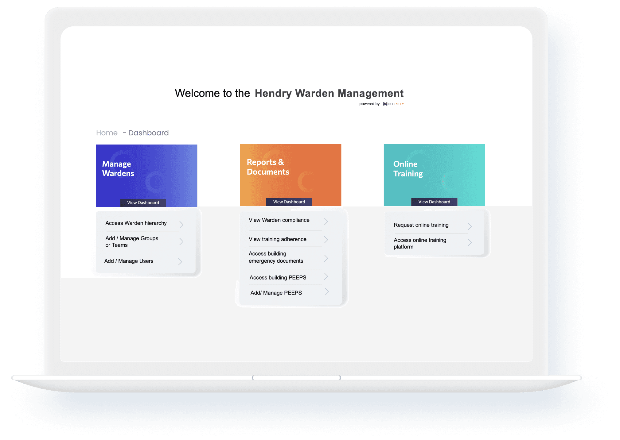
The original Hendry Warden Management dashboard featured a static, card-based layout divided into three main sections: Manage Wardens, Reports & Documents, and Online Training. While functional, the experience was rigid and outdated.
1) Research and Discovery :
Heuristic Evaluation:
A UX review of the original dashboard revealed key heuristic issues: unclear navigation, low task visibility, and high interaction cost. Core actions were buried, violating principles like efficiency of use and visibility of system status, highlighting the need for a more intuitive, data-driven interface.
Sketches
I started sketching based on the key pain points from user feedback and findings from the heuristic evaluation, focusing on solving the biggest usability issues first.
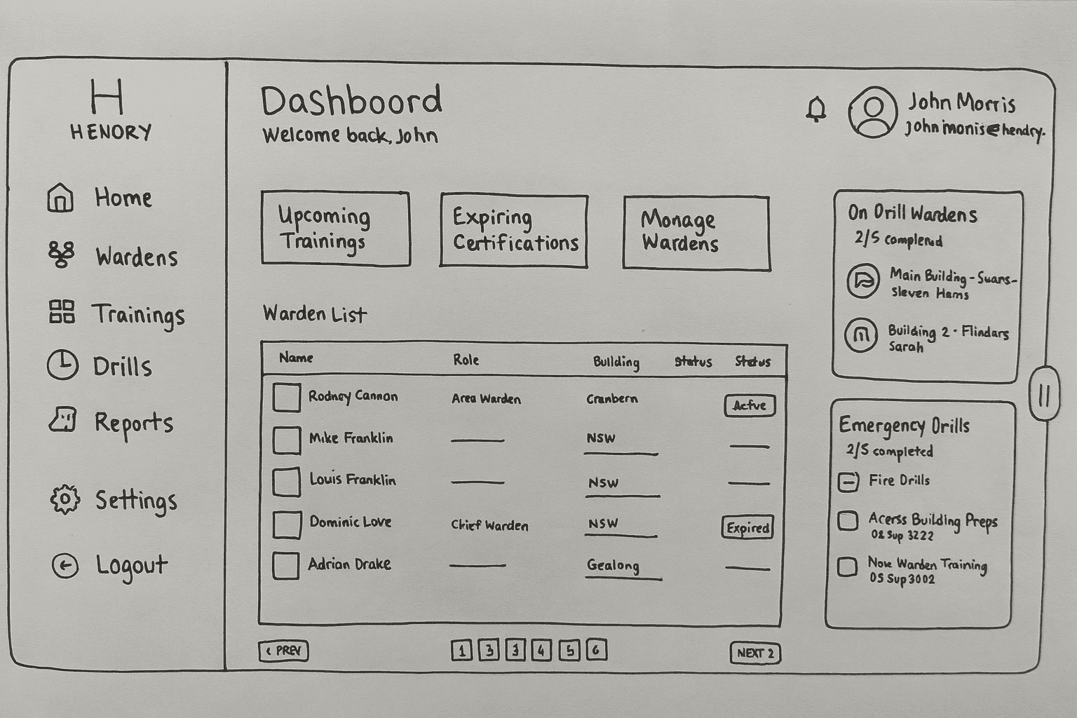
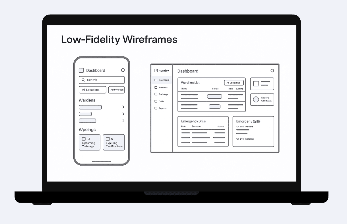
Wireframes – Lo-fi
I created low-fidelity wireframes to map out the core user flows, including a filtered and sortable warden list with clear status badges, an emergency drill history with progress states, mobile-friendly layouts with collapsible sections, and alert cards highlighting training and certification needs.
Collaborating with Stakeholders and Developers
Throughout the project, I worked closely with stakeholders and the development team to make sure the dashboard met business needs, aligned with technical constraints, and stayed true to the overall vision. This collaboration helped bridge gaps early, speed up decision-making, and ensure the final experience was both user-friendly and feasible to build.
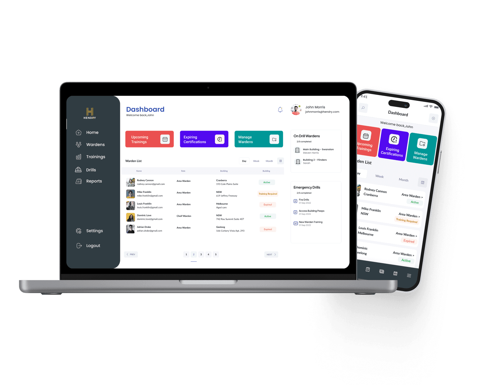
UI Design & Components
Once I fixed the main usability issues, I designed the final screens in Figma. I kept the layout clean and easy to use, so it would feel calm and clear during stressful situations. Since the product is used on both desktop and mobile, I made sure the design worked well on all screen sizes.
Some components weren’t available in the existing design system, so I created new ones to suit the workflow:
Status badges: Active, Expired, Training Needed
Action buttons: Assign Warden, Export Report
Mobile-first views: For wardens on duty
WCAG-compliant design: Clear contrast and accessible text
Project Learnings
This project had its challenges; understanding warden workflows took time, and priorities shifted along the way. I kept developers in the loop early, which helped avoid rework and kept us aligned.
Sometimes it was hard to get stakeholders on board, but using visuals and design thinking helped us communicate ideas clearly and move forward.
The biggest thing I learned? In emergency-focused design, it’s all about clarity and speed—helping people act fast when it matters.